How To Create An Attention-Grabbing, Professional Steam Capsule In Less Than 20 Minutes
If you're worried that your game will fail because your Steam capsule art looks bad and won't attract players to click our Steam store page, then here's 3 simple steps you can do right now to make it look professional.
You don't need a degree in graphic design... you don't need to hire a professional marketing artist... you don't need to spend weeks working on a good looking capsule that will grab attention.
In fact, what you'll learn in this article will only take you 20 minutes do to do.
So, if you want a professional looking Steam capsule that grabs a player's attention, then here's what you need to know and exactly what to do...
What's The Difference Between Professional Vs. Amateur Capsule Art Design?
I'm writing this because I'm helping out a small game dev with their indie game with some marketing consultation. The dev is worried that because of their low quality capsule art, players won't bother clicking on their Steam page.
So, I'm going to use their capsule as an example. And I'm going to take off the "kids gloves" and be a bit critical. But my intent isn't to bash any game dev here. My intent is to point out how we can all improve our marketing and make an attention-grabbing Steam capsule...
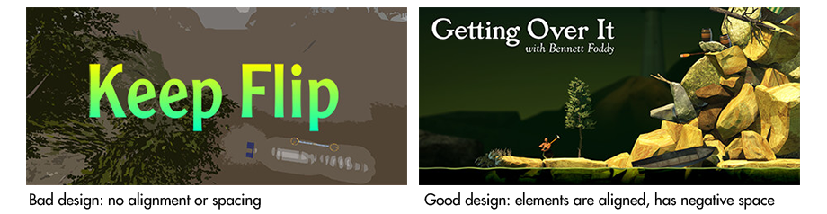
Saying that, have a look at these two Steam capsules. Right away you can tell which is professional versus which is amateur.
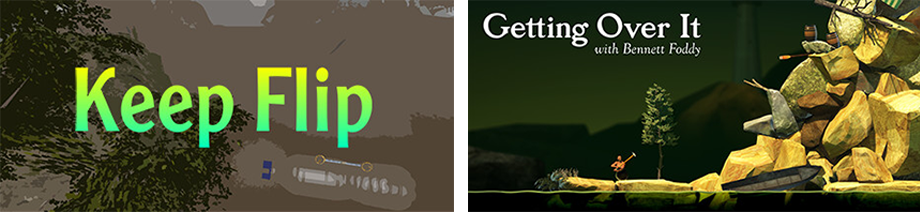
Amateur vs Pro Steam capsule design
But why is that?
Why does the first Steam capsule art look messy, all over the place and amateur, while the other looks clean, tight, and professional?
Let's go into depth on what's going on because once you understand simple design rules, you'll know how to create your own professional looking capsule -- in less than 20 minutes.
Simple Design Rules Any Game Dev Can Use To Make Their Steam Capsule Art More Attention-Grabbing
If you want your Steam capsule to be attention-grabbing, then here are some simple design rules you need to know. Once you understand this, I'll show you step-by-step how you can apply these rules and help you make a professional capsule in less than 20 minutes.
Here's what you need to know...
Design Rule #1: Good Design Doesn't Call Attention Onto Itself
The goal of good design is "instant visual understanding". Let me explain what I mean...
Good visual design is just like good sound design. Good sound design is "invisible". The only time you hear sound design is when it is BAD.
It's the same with good visual design. You'll never notice good visual design because it's not there to show off itself. Good design is there to show off the content it's displaying. It's there to amplify the core message.
Good design amplifies the core message. Good design lets you instantly understand what's going on visually.
So when looking at "Keep Flip's" capsule, you notice the bad design. And this takes away from the message the capsule is trying to convey.
But with "Getting Over It", you hardly notice any design, the good design is invisible. You instantly understand what's going on.
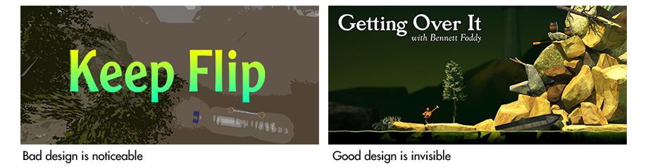
When comparing these two designs, you notice the bad design, while the other you hardly notice the design at all.
And in a moment, you'll see that there is a LOT going on with "Getting Over It" capsule art design. And later you'll learn how you can apply the same techniques to your own capsule art.
But for now, let's keep going and learn more about good design vs. bad...
Design Rule #2: Good Design Is Simple... To Make Things Easy To Understand
Good design is not complex. There's not a lot of elements stacked on top of eachother. In fact there are very few elements.
This is exactly what "Get Over It" accomplishes: simple design, very few elements, and a person instantly understands what they're looking at.
You have to remember, Steam capsules are small. And a person will glance at it for maybe a few seconds. If you use a complex design, you'll confuse people. And confusion doesn't grab attention.
What grabs attention is a simple design, with very few elements, where a person instantly understands what's going on.
Ok, let's keep going and all of this will make sense...
Design Rule #3: Start With A dominant Visual Element
Your eye will be pulled toward the biggest or brightest visual element. Then it'll move to the next biggest visual element. There is called a "visual hierarchy".
The visual hierarchy goes:
- Biggest element
- Second biggest element
- Smallest element
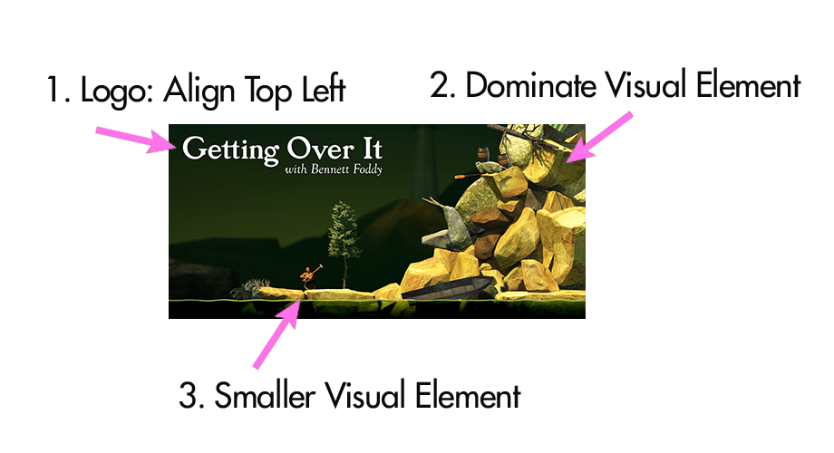
In "Getting Over It", the dominant visual element is the bright logo on the top left. Then your eye moves to the right to the rock mountain. Then your eyes moves back to the left to the bottom to the small little dude.
There is a big, middle, and small element for your eye to follow. Your eye likes to follow a rhythm because that's the main job for an eye: to explore it's environment. Your eye is constantly scanning like this.
This is important because if you don't have this visual "hierarchy" then your eye gets stuck, and doesn't know where to go next.
In "Keep Flip", the dominant visual element is the logo. But then then there is no other visual elements. There is no hierarchy. There's nowhere else the eye want to follow. And your eye want to follow a flow... if there is no flow, then it's confusing where the eye should go next.
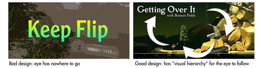
In "Keep Flip" capsule art, your eye has nowhere to go. With "Getting Over It", your eye has a flow to follow.
And remember, your Steam capsule only has a few seconds to grab attention. If there is any small amount of confusion, you've lost their interest.
This brings me to my next rule...
Design Rule #4: Follow "Reading Gravity"
I just talked about "visual hierarchy" (where you have a big, middle, small element your eye can follow). But what else is important is the ORDER of your elements.
Let me explain...
If you notice, "Getting Over It" the biggest or brightest dominant visual element is top left. Then your eye follows right, to the mountain... then to the player.
We are trained (in the Western world) to read from top left to right, top to bottom. The eye naturally wants to start at the top left, and move down to the right.
But if we go against "reading gravity" that just adds more confusion. So that's why I said ORDER is important. If you have a big dominant visual element, then stick it in the top left because that's where our eyes want to naturally start (at least in the Western world).
In "Keep Flip", there is NO reading gravity. All the visual elements are basically centered. There isn't interesting because the eye has nowhere to explore -- except whatever is in the middle.
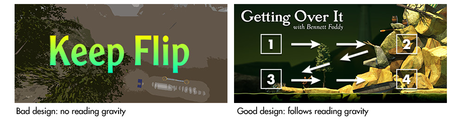
"Keep Flip" breaks reading gravity. In "Getting Over It", you start on the top left, where your eye naturally wants to go because that's how we read (in the Western world).
Design Rule #5: Contrast
In "Getting Over It" you'll notice that the background is darker than the foreground. And the logo is white compared to the overall picture. This contrast helps "instant visual understanding".
But on with "Keep Flip" you'll notice the logo is bright, sure. But the contrast isn't right. There's something off having a logo with a gradient.
When you don't have any contrast, it's hard for the eye to understand what it should be looking at first. This adds confusion. And if your player is confused about what they're looking at, then their attention is gone.
Design Rule #6: Alignment And Spacing
You'll notice that "Getting Over It" uses spacing perfectly. The logo is aligned top left. The mountain is aligned right. And the character is not really centered, to the left. The logo and the character on the left sort of balances itself with the big mountain on the right. There's a weird symmetry.
However, most amateurs will align things centered. And at fist this makes sense. If you want something to stand out and have people look at it first, then put it in the center, right!?.
But good design is more than just centering things. It incorporates spacing, alignment, reading gravity, dominant visual elements, hierarchy, and simplicity.
When you center elements like this there is no space. Adding space to your capsule design makes it look more professional.
Remember, the goal of design is to show off the message and create instant visual understanding. When we just center things, or just plop elements wherever we feel like it, then it breaks down that visual understanding.
Rule #7: The Rule of Thirds
Another element I want you to notice with "Getting Over It", is that there are 3 things in front of you. The logo, the character, the mountain.
And each element is placed in a grid that follows the "rule of thirds".
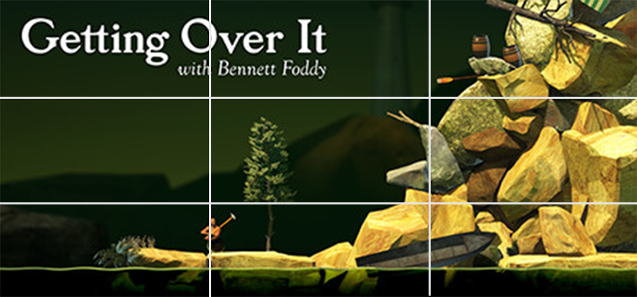
I think the reason we find the "rule of thirds" so pleasing to the eye is because of its "rhythm". You start with the top left with the logo, move to the mountain, the the character at the bottom, then back to the logo. There is a rhythm, balance, and symmetry. Your eye is "exploring".
And again, the purpose of an eye is to survey an area and take in information. It wants to scan, and not just look at something totally centered.
But if we just center all the elements, we lose that balance and symmetry and rhythm. There is nothing to explore. It's hard for the eye to separate all the elements. And this makes it hard to understand what's going on.
But Rules Are Meant To Be Broken!
It's true, great artists break these rules all the time.
And there are a lot of Steam capsule art designs that don't follow these rules. But those designs are made by well paid artists. These artists have years of experience behind them, and they can create designs that look pleasing to the eye and not follow these rules.
But for now, if you don't have time and money, then the rules you just learned will still give you something that is at least 5x better than your old capsule design.
Ok, now how do you take everything you've learned and apply it to your own capsule art? How do you create a capsule art that is attention-grabbing, professional, and takes less than 20 minutes to make?
Let's to that next...
The "Steam Capsule Formula"... A 3 Step Guide On How To Make Your Capsule Design Grab Attention
You're about to learn what I call the "Steam Capsule Formula". It's a formula created for game devs who have no art experience, and want something that looks professional -- without spending more than 20 minutes on it.
So that's what you're going to learn next: How to create a professional Steam capsule -- in under 20 minutes.
But before you and I start, here are a few resources you'll need:
- A graphics editor like Photoshop, GIMP, Affinity Designer or Photo, Inkscape
- Steamworks Graphical Asset Documentation
Ok, ready? So now let's take everything you've learned and apply it to your own Steam capsule art design.
Steam Capsule Formula, Step 1: Grab These Four Art Assets From Your Game...
What I want you to do is to grab the following art assets from your game:
- Art asset #1: Main character(s) or main vehicle from your game
- Art asset #2: Background image of your game's environment (this could be a screenshot)
- Art asset #3: A weapon, or unique item from your game, or a sidekick character
- Art asset #4: Your game logo
Let me show you my example...

I got my main character, background, a unique side character, and a logo. So find the same 4 art assets for your game.
Steam Capsule Formula, Step 2: Open A 460px x 215px @300 DPI Digital Image In Your Graphics Editor
In this example, I'm using Photoshop. But all editors pretty much have the same settings. So go open a new file, and make sure you use the following settings:
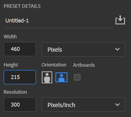
The reason you're using 460px x 215px is because that is the size of the Header Capsule Art according to Steam's Graphical Documentation. Also, using 300 DPI (or PPI) is better than using 72 DPI when editing digital images.
Once you got that open, here's what to do next...
Steam Capsule Formula, Step 3: Arrange Your Art Assets By Following The Design Rules You Just Learned...
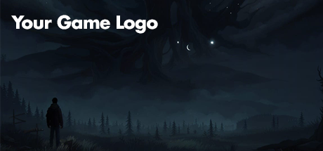
Step 3 Part 1: Paste your background so it covers your entire image. Also, if your background is too bright, darken it a bit (you want your background elements to be darker than your foreground elements).
Here's my example...
Step 3 Part 2: Grab your logo, and align it top left. Make sure your logo is white. If your logo is in color, make sure that it won't blend with the background too much (this is why I had you darken your background a bit so that the foreground elements pop out more).
Here's my example...
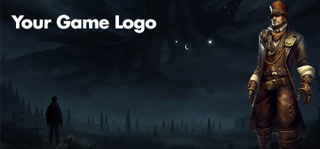
Step 3 Part 3: Align your main character or main vehicle on the right side. Make sure this element is big and that it doesn't blend with the background. And again, make sure it's big and it dominates the right side.
Here's my example...
Step 3 Part 4: Now to balance the big element on the right with the logo on the left, add in your side character or unique item. Make it smaller than the logo and main character / vehicle.
Here's my example...
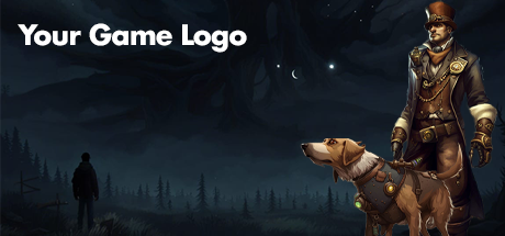
In this example, I decided to put the dog (sidekick) with my main character because I felt there was enough balance between the logo and character on the right. That's because my background image has a shadowy figure on the left side that adds symmetry to the entire image.
More Examples To Help You With Ideas...
This is exactly the same formula Get Over It" uses:
You see what I mean that good design is "invisible". At first glance, you don't notice much going on with the design of the "Getting Over It" capsule art. It's not fancy. It's not complicated.
But if you look closely, there was a lot of thought put into this design.
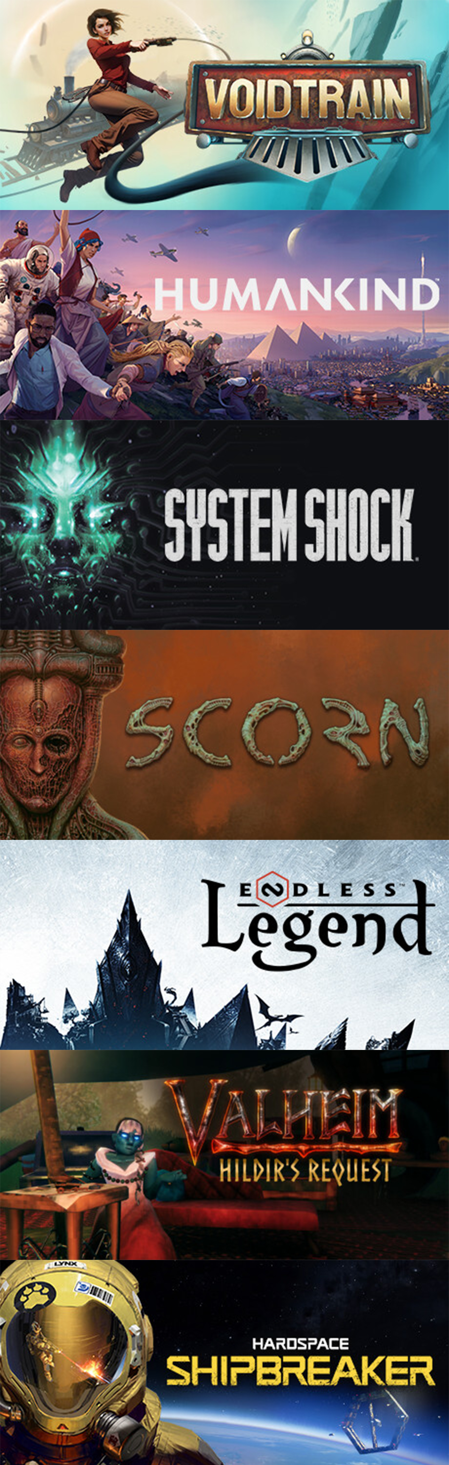
And you'll see this same "formula" with other Steam capsules:
Here's some examples of Steam capsules that follow this formula:
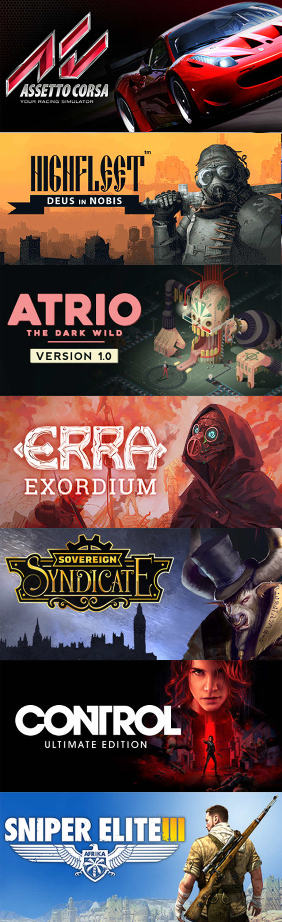
Notice that the logo is aligned top left. The right will have a large visual element. And often you'll see a small visual element, sometimes on the bottom, left side.
Also, once you get use this "formula", then you can play around and break the rules a bit. For example, you can flip the formula around and have the logo on the right and the character on the left...
Your Action Step RIGHT NOW...
Dumb question: is it possible to know how to ride a bike by just reading about it an article? Nope. You gotta get on the seat and do it IRL. The only way you learn something is when you experience it.
So that's why this is the most important step right now. You learned a lot. But all of it will go to waste if you don't put it into action.
So do this RIGHT NOW. It'll only take 20 minutes...
Get your 3 or 4 art assets (Logo, background, main character/vehicle, secondary character/item/etc.)
Open a graphics editor, and open a new file with the following dimensions: 460px x 215px @ 300 dpi (or ppi).
Place your background and cover the entire image. On the top left, align your logo. On the right, add your main character -- make it BIG. Then take your secondary character and play around and see where it fits best.
Do this right now because you'll see that you don't need to hire an expensive artist or designer to make an attention-grabbing Steam capsule. All you need is to follow some design rules, and you're capsule art will look professional.
How I can help you find players, increase wishlists, and improve your chances of a successful game launch...
If you hate marketing, and don't have time to do it, then you can hire me. But before you commit to anything, let's start with a no-cost, small and simple marketing project...
Below is my contact info. Send me a message and tell me more about your game, and what challenges you're having when marketing your game.
I'll reply back with some questions to understand your challenge a bit better.
Once I understand your game and your challenge better, I'll come back with a PDF report that will have marketing tips and tools specifically designed to help you with your particular challenge.
Again, no cost, no expectations. If you like my marketing tools and tips that I've come up with for you and your game, then we can talk about a formal, paid project.
But for now, let's start small and simple. Send me a message and tell me more about your game and what challenges you have... and we'll go from there!
Need an affordable but professional website to help you attract potential players, streamers, or publishers?
Click the link below to find out what you get and how much...
Thanks for reading! Hope you got one insight to help you market your indie game and start growing your audience, and finding customers!

Dariusz Konrad
Email: dariusz at mainquestmarketing dot com
Discord Username: dariuszkonrad
LinkedIn: My entrepreneurial successes
Work: Game devs I've helped so far